With the script written I was very aware of the fact that we need to make this project stand out in order to gain interest from everyone we want involved, so the next logical step was to create some mockup poster designs of how I envision marketing the film.
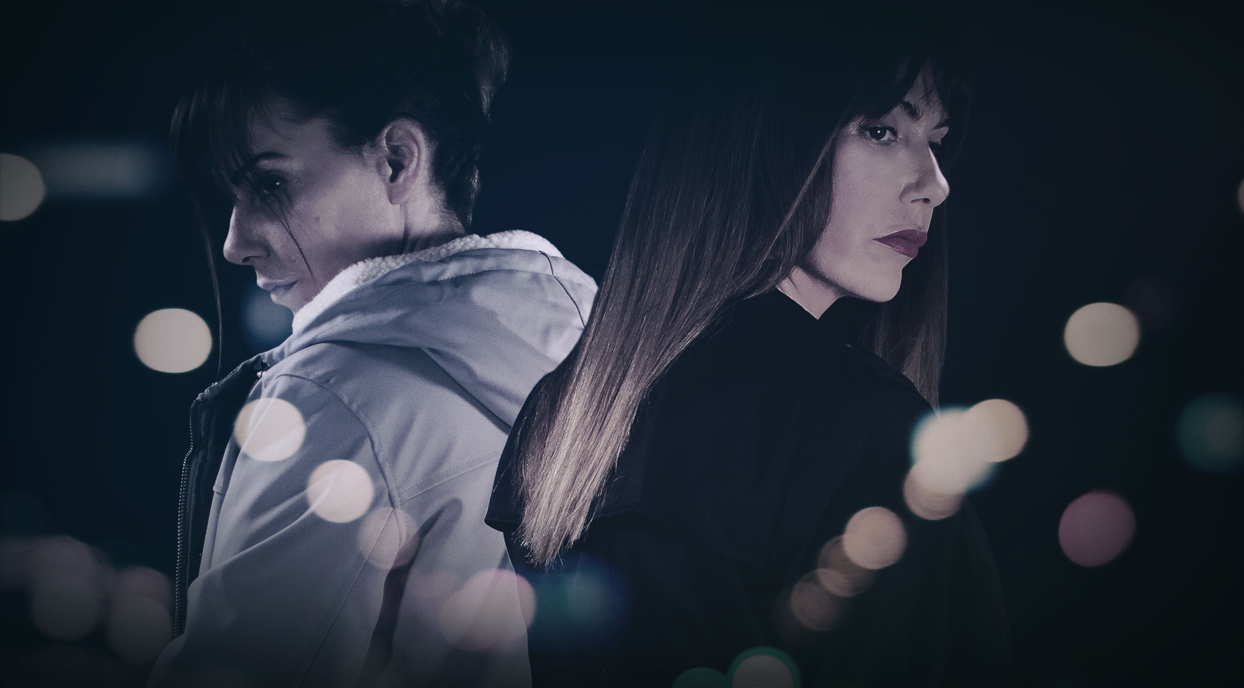
With the film’s story being between the two sisters I wanted to focus predominantly on their characters (including the ‘character’ of London) whilst also showcasing the style which the film will take. Using overlaid lens ‘Bokeh’ of City lights I tried to design the posters with a modern take on the ‘good v evil’ with Helen’s and Athena’s characters filling the posters in juxtapositional attire (light and dark) whilst looking as though they are ‘part’ of the city, since London has just as big a character to play in the film as the sisters.
Overall the style replicates an idea I have for the visual aspect of the film once its made which is ‘Spectacle of the Real’. I want the film to feel real but also look ‘glamorous’ to highlight the fact that it is a work of fiction…Spectacle of the Real.
This style was then used throughout all 3 posters since I wanted to ensure we had a main design poster and then two individual character posters featuring each of the sisters, again playing on the ‘good v evil’ we have Athena’s (antagonist) poster in harsh cold tones of blue whilst Helen’s (protagonist) is in heavenly golds to really separate the characters but still keep everything within the same style. This also relates to a concept I had for the overall marketing of the film in which we play on the idea of – are you “Team Helen” or “Team Athena” – and use the marketing in a more personable way for audiences to relate to.
Below are the three poster designs we now have to help give people a better idea of what the film will look like – and last but not least, a huge thanks to Thea Knight who modelled as both Helen and Athena for the posters, but who will actually be playing the role of Athena in the film! Exciting times ahead.


